Introduction
Welcome to this Machine Learning tutorial! In this tutorial supervised and unsupervised learning will be introduced.
Machine Learning (ML) is mainly concerned with identifying patterns in the data in order to predict and classify. Previously we used linear regression and logistic regression to achieve this. However, we heard about them in the context of statistical learning (SL), since they are widely used for inference about the population and hypotheses. Typically, SL relies on assumptions such as normality, homoscedasticity, independent variables, and others; whereas ML often ignores those. We continue with supervised learning (i.e. response is known) approaches. Please be sure you have done the Statistical Learning tutorial. Particularly, we will look at tree-based methods such as the decision tree and random forest. Then we move to unsupervised learning approaches. Here, we will focus on clustering algorithms.
Predictions and Trees
Regression Tree Introduction
We will use the regression tree (= decision tree) for predictions. The quality of models will be compared using the root-mean-squared-error (RMSE) and the mean-absolute-percentage-error (MAPE).
In the Statistical
Learning tutorial we introduced the faithful dataset
and predicted eruption times using linear regression. Now, we will do
the prediction using the regression tree method.
We will begin by developing some basic understanding of the regression tree algorithm.
First we extract 10 records from the original dataset.
ns = 10  # intended number of sample records
set.seed(1) # fix random generator (for reproducibility)
I = sample(1:nrow(faithful), ns) # get the sample indices
D = faithful[I,] # extract the sample
D

x = D$waiting; y = D$eruptions; # for easy access
cat('average of y is ', mean(y))
Let us visualise the data.
# library(ggplot2)
g <- ggplot(aes(x=waiting,y=eruptions), data = D)+
  geom_point(size=4, color="brown")+
  geom_text(label=1:ns, nudge_x = .5, nudge_y = .05)+
  xlab("x = waiting time [min]")+ ylab("y=eruption time[min]")+
  theme(text = element_text(size=12))
g
How would you split the data to minimise MSE? Recall the mean squared error is: \[\text{MSE} = \frac{1}{n}\sum_{k=1}^n \left(y_k -\hat{y_k}\right)^2, \] where \(n\) are the number of observations, \(y_k\) is the observed value (response, output), \(\hat{y}_k = \hat{f}(x_k)\) is the modelled value (prediction), and \(x_k\) is the input.
Before using the MSE, try it intuitively.
Probably, you did the split in a way similar to:
\[x_s = \frac{x_1+x_5}{2} =
\frac{63+73}{2}=68,\] i.e. xs = (x[1]+x[5])/2.
Now, we can use this to predict (approximate) the \(y\)-values on the left \(c_1\) and right side \(c_2\): \[c_1 = \frac{1}{5}(y_1+y_2+y_6+y_8+y_9) = 2.04\] That means the MSE on the left side is: \[ \text{MSE}_\text{left} = \frac{1}{5}( (y_1-c_1)^2+(y_2-c_1)^2+(y_6-c_1)^2+(y_8-c_1)^2+(y_9-c_1)^2) \]
\[c_2 = \frac{1}{5}(y_5+y_7+y_{10}+y_4+y_3) = 4.1\] Similarly, to before we compute the \(\text{MSE}_\text{right}\). Other splits will give a higher MSE.
Let us visualise this additional information.
c1 = mean(y[x<68]) # left region
c2 = mean(y[x>=68]) # right region
g2 <- g + geom_vline(xintercept = 68, size=2, color = "blue")+
  geom_text(x=68,y=3, label="68", color="red")+
  geom_segment(aes(x=c(45),xend=c(68), y=c(c1), yend=c(c1)),
               size=2, color="red", linetype=4)+
  geom_segment(aes(x=c(68),xend=c(95), y=c(c2), yend=c(c2)),
               size=2, color="red", linetype=4)+
  geom_hline(yintercept = 3.1, size=2, color = "red")
g2
Decision Stump
A decision stump is a one level decision tree. That means, the root (internal node) is connected to the terminal nodes (known as leaves). The prediction is based on a single feature (also known as 1-rule).
How would you represent this information as a decision stump?
#library(pacman); # package manager
#p_load(rpart, rattle, rpart.plot, RColorBrewer) # load packages
dt <- rpart( eruptions ~ waiting, D, minsplit=2, maxdepth=1)
fancyRpartPlot(dt, sub="decision stump")
Let’s explain the graph. The numbers on the top of each node show the node numbers 1, 2 and 3. Let us consider node 1 (root node). If we take the average of all observations, then we get \(\bar{y}=3.1\). This is the average eruption time taken from the \(n=10\) observations, which represents 100% of the data.
Underneath node 1 we have the 1-rule (decision, if condition). That means, if the the waiting time is less than 68 minutes we follow the yes-branch on the left; otherwise the no-branch on the right. The yes-branch takes us to node 2 (a leaf node). We can now read the node 2 information. In case we waited less than 68 minutes we predict that the waiting time is 2 minutes. This is based on \(n=5\) eruption time observations, which represent 50% of the data.
What is the eruption time if we waited 80 minutes? Answer: 4.1 minutes.
The above used the function rpart -
Recursive Partitioning and
Regression Trees. It has a couple of
rpart.control parameters such as the minimum number of
observations that must exist in a node in order for a split to be
attempted (minsplit), and the maximum depth of the final
tree (maxdepth). The root node is at depth zero.
Level 2 - Decision Tree
Can you split again? “The growing of a tree” split region 1 (left) and 2 (right). This is a bit harder now - looking at the left region. It is not obvious where to split. We need to test all possible splits and select the one that minimises the MSE.
The rpart function helps us finding these splits. We
just have to increase the maxdepth by one level.
dt <- rpart( eruptions ~ waiting, D, minsplit=2, maxdepth=2)
fancyRpartPlot(dt, sub="Three split nodes - a level 2 regression tree.")
c3 = mean(y[c(9,8,2,6)])
c4 = y[1]
c5 = mean(y[c(5,7,10,4)])
c6 = y[3]
g2 +
geom_segment(aes(x=c(45),xend=c(61), y=c(c3), yend=c(c3)),
size=1, color="green", linetype=4)+
geom_segment(aes(x=c(61),xend=c(68), y=c(c4), yend=c(c4)),
size=1, color="green", linetype=4)+
geom_vline(xintercept = 61, size=1, color = "blue", linetype=4)+
geom_vline(xintercept = 87, size=1, color = "blue", linetype=4)+
geom_segment(aes(x=c(68),xend=c(87), y=c(c5), yend=c(c5)),
size=1, color="green", linetype=4)+
geom_segment(aes(x=c(87),xend=c(95), y=c(c6), yend=c(c6)),
size=1, color="green", linetype=4)+
geom_hline(yintercept = 3.1, size=1, color = "red", linetype=4)What is the expected waiting time when we waited:
- 50 or 60 minutes?
- 80 minutes?
- 65 minutes?
- 100 minutes?
Use the previous two diagrams and compare it to the following.
predict(dt, data.frame(waiting=c(50, 60, 80, 65, 100)))Reflect how did you obtain this tree? How many split points are created? Can you formulate this as an algorithm!?
Next, learn a prediction tree for the train data (e.g. 70% of the faithful data). Test the quality of the model by computing the MSE, RMSE and MAPE. Compare the results to linear regression computed in Statistical Learning tutorial.
# training & test data split
n  = nrow(faithful); ns = floor(.7*n);
set.seed(1); I = sample(1:n,ns);
train = faithful[I,]; test = faithful[-I,];

# regression tree
dt <- rpart(eruptions ~ waiting, train, minsplit=3, maxdepth=7)
# fancyRpartPlot(dt)

# Quality measures
mse  <- function(y,yh) {mean((y-yh)^2)}
rmse <- function(y,yh) {sqrt(mse(y,yh))}
mape <- function(y,yh) {mean(abs( (y-yh)/y ))}
derr <- function(y,yh) {sprintf('MSE = %.3f, RMSE = %.3f, MAPE = %.2f%%\n',
                                    mse(y,yh),rmse(y,yh),100*mape(y,yh))}
y  = test$eruptions
yh = predict(dt, newdata = test)
cat("Regression tree: ", derr(y,yh))

# compare with linear regression
lr <- lm(eruptions ~ waiting, train)
yh = predict(lr, newdata = test)
cat("linear regression: ", derr(y,yh))
Regression Tree for Wage Data
We will use the Wage dataset from the ISLR package. Please see the related book James et al. (2013) for more details.
# library(ISLR) #loads the Wage data (pre-loaded)
data(Wage); head(Wage, n=3L);
str(Wage)
There are 3000 observations and 11 variables. Most variables are
factors. We observe that the data is given per year. The
salary (wage) is thousands of dollars.
Does the wage depend on the person’s age?
a = ggplot(Wage, aes(age, wage))
a+geom_point(colour="gray")+geom_smooth(method="lm")+geom_smooth()
# plot(Wage$age,Wage$wage) # built-in plot (avoids ggplot)
Visually, it appears that there is a small correlation. We not two distinct groups one with continuously high salary and one that increases initially before dropping. The group distinction might be well modeled with decision trees. The nonlinearity in the second group may require a new polynomial feature to improve the model quality.
What is the correlation coefficient?
cor(Wage$age,Wage$wage)The correlation value indicates that there is only a very week correlation. That means, to infer the salary from the age variable is risky.
We will now derive a few models and compare their test-accuracy.
Split the data into 70% training samples and 30% test samples. We
will also remove the logwage (column 10) since this is the
logarithmic wage (see also cor(Wage$wage, Wage$logwage)).
Hence, defeating the purpose of predicting the wage.
n = nrow(Wage); ns = floor(.7*n);
set.seed(1) # random generator seed
I = sample(1:n, ns)
train = Wage[I,-10]
test = Wage[-I,-10]
cat("train: ",ns, " observations")
Note, once the best model is derived the entire data-set can be used as training data.
Linear Regression
Create a linear regression and “predict” the salary (wage) at the age of 20, 25 and 30.
pm <- lm(wage ~ age, train)
predict(pm, data.frame(age=c(20,25,30)))
What is the test root-mean-squared-error (rmse)? \[\sqrt{\frac{1}{n}\sum_{k=1}^n \left(y_k -\hat{y_k}\right)^2} \]
rmse <- function(y,yh) {sqrt(mean((y-yh)^2))}

pm <- lm(wage ~ age, train)
yh = predict(pm, newdata=test)
y  = test$wage
rmse(y,yh)
The mean-absolute-percentage-error (mape, MAPE) is defined as: \[\frac{1}{n}\sum_{k=1}^n \left|\frac{y_k - \hat{y_k}}{y_k}\right| \]
What is the test-MAPE ?
mape     <- function(y,yh) {mean(abs((y-yh)/y))}

pm <- lm(wage ~ age, train)
yh = predict(pm, newdata=test)
y  = test$wage
mape(y,yh)
Note: What happens, when an element is zero (\(y_i=0\))? The formula breaks. That means it is assumed that all elements are non-zero. Sometimes the MAPE is defined as: \[\frac{1}{n}\sum_{k=1}^n \frac{|y_k - \hat{y_k}|}{y_k} \] This means, negative values would reduce the error; but it works fine if all elements are positive.
That means, on average we expect a model error of 29.2%.
Non-linearity
Previously, we saw that the salary seems to have some non-linearity initially salary increases with age and then it drops again.
What is the correlation between age squared and wage?
cor(Wage$age^2,Wage$wage)This is even lower than before. This does not support the visual-observation very well.
Create a new model that integrates the squared age in the model. What is the MAPE?
pm <- lm(wage ~ age + I(age^2), train )
mape ( test$wage, predict(pm, newdata=test) )
We see by adding this feature the accuracy has improved.
Note: I() (i.e. as.is) needs to be used, because
^ is used to describe interactions in formulas .
Alternatively, you could create numeric data
cbind(age, age^2) or poly(age,2,raw=TRUE).
Adding more terms will improve the accuracy. Try to add
age^3 and age^4 or try to add a polynomial of
degree 20. The theory of Taylor expansions is behind these
improvements.
Regression tree
Now, let us use the regression tree (decision tree) to gain more insights.
We begin with the simple formula wage ~ age.
dt <- rpart( wage ~ age, train)
yh = predict(dt, newdata = test)
y  = test$wage
mape(y, yh); # rmse(y, yh)
fancyRpartPlot(dt)
The test-MAPE of the DT is slightly worse than the LR.
Let us use now all variables.
dt <- rpart( wage ~ ., train)
mape(train$wage, predict(dt)); # training error
mape(test$wage, predict(dt, newdata=test)); # test error
The low training-MAPE is deceiving, making us believe that we can predict very well the expected salary given all the previous factors. However, the high test-error means that overfitting took place. That means a less complex tree would be better. We can obtain such a tree by pruning.
Pruning
Pruning a decision tree is used to reduce complexity (bias).
printcp displays the complexity parameter
(CP) table and plotcp gives a visual display of
it.
printcp(dt)
plotcp(dt)
Let us use the displayed CPs and relative error to prune the tree. More specifically the CP between 0.016 and 0.026.
dtp <- prune(dt, cp=0.021)
mape(test$wage, predict(dtp, newdata=test)); # test error
plot(dtp,margin=0.2); text(dtp, pretty=0, use.n=TRUE, all=TRUE, cex=.8)
This is also know as post-pruning.
Additionally, we could have done pre-pruning. That
means we provide a few control parameters to rpart such as
minbucket (minimum number of observations in leaf node),
minsplit (minimum number of observations for a split),
etc.
dt.pp <- rpart( wage ~ ., train, control = rpart.control(minbucket=100))
mape(train$wage, predict(dt.pp)); # training error
mape(test$wage, predict(dt.pp, newdata=test)); # test error
fancyRpartPlot(dt.pp)
Classifications
We will use the Titanic dataset. Please see the Statistical Learning tutorial for a brief introduction and the logistic regression for initial classifications. Here, we will show how to use the decision tree and random forest methods.
Warm-up and Kaggle
What is the proportion of survivors?
T = table(titanic_train$Survived)
prop.table(T)
Answer: 38.4% survived.
Create a file that you can submit at Kaggle’s competition. Predict that there are no survivors.
# initialise such that there are no survivors
ns = rep(0,nrow(titanic_test)) #
# create submission file for Kaggle competition
submit <- data.frame(PassengerId = titanic_test$PassengerId, Survived = ns)
# write.csv(submit,file="no-survivors.csv", row.names = FALSE)
head(submit, n=3L)
The file can be submitted using this link on Kaggle.
Decision trees
Plot a simple decision tree using Survived ~ Sex.
# library(rpart)
dtp <- rpart(Survived ~ Sex, data=titanic_train, method="class" )
plot(dtp,margin=0.2); text(dtp, pretty=0, use.n=TRUE, all=TRUE, cex=.8)
This is pretty ugly. We want to have a better decision tree visualisation and will use another package.
# library(pacman); p_load(rattle, rpart.plot, RColorBrewer)
dt <- rpart(Survived ~ Sex, data=titanic_train, method="class" )
fancyRpartPlot(dt)
This is much better. What is the meaning? The green colours mean
passengers have died and blue means they survived. The root node (1)
states that 62% of the passengers died. Hence, 38% survived. This agrees
with the table we created earlier. Now, there is the questions
Sex = male (is the passenger male)? If the answer is yes
then we follow the left branch, otherwise the right one. Going to the
left we end up at the green node 2. That means, males have a 81% chance
of dying; and they constitute 65% of the data. So, a tree that is very
easy to interpret.
What is the training-accuracy of this tree?
yh = predict(dt,type="class")
y  = titanic_train$Survived
mean(y == yh)
Answer: 78.7%
Let us now get more factors into the tree. First we will convert
several fields to factors. Furthermore, we will set the age
na fields to its average. The Name column will
be dropped.
train = titanic_train; test = titanic_test;
cols <- c("Pclass", "Sex", "Ticket", "Cabin", "Embarked")
train$Survived = as.factor(train$Survived)
train[cols] <- lapply(train[cols], factor)
test[cols]  <- lapply(test[cols], factor)
mv = mean(c(train$Age,test$Age), na.rm =TRUE)
train$Age[is.na(train$Age)] <- mv
test$Age [is.na(test$Age) ] <- mv

# remove columns , e.g. train$Name = NULL
train = subset( train, select = -c(PassengerId, Name, Ticket, Cabin))
test  = subset( test, select = -c(PassengerId, Name, Ticket, Cabin))
cat("train: ",nrow(train)," rows"); head(train)
cat("test: " ,nrow(test)," rows"); head(test)
Please note that this test set is for Kaggle submissions. That means
it does not include the Survived field.
Is the new train-accuracy better using all factors?
dtc <- rpart(Survived ~ ., data=train, method="class" )
yh = predict(dtc,type="class"); y  = train$Survived
mean(y == yh)
The accuracy has improved.
Let’s visualise the new model.
fancyRpartPlot(dtc)Unfortunately, over-fitting can lead to worse test-accuracy.
yh <- predict(dtc, test, type="class")
head(yh, n=3L)
Pruning
Pruning a decision tree is used to reduce complexity (bias).
printcp displays the complexity parameter
(CP) table and plotcp gives a visual display of
it.
printcp(dtc)
plotcp(dtc)
Let us use the displayed CPs and relative error to prune the tree. More specifically the CP between 0.027.
dtp <- prune(dtc, cp=0.027)
#plot(dtp,margin=0.2); text(dtp, pretty=0, use.n=TRUE, all=TRUE, cex=.8)
fancyRpartPlot(dtp)
This is also know as post-pruning.
Try to submit the new model to Kaggle and see whether you improved your ranking.
Please have a look at Trevor Stephens - Titanic for several more interesting ideas.
Random Forest
Let us now use the random forest method. This method creates several decision trees by varying the number of features and amount of data used. These trees then have a majority vote of which group to choose for a given observation.
The random forest function cannot deal with factors that have more
than 53 categories. So we had to remove Ticket and
Cabine from the input data.
#library(randomForest)
set.seed(7)
rf <- randomForest(Survived ~ ., data = train)
summary(rf)
What is the training-accuracy of this model?
yh = predict(rf)
mean( yh == train$Survived)
Classifications - Iris
We will use the Iris dataset and divide it into test and
train data.
n = nrow(iris)
ns = floor(.7*n)
set.seed(1); I = sample(1:n, ns)
train = iris[I,]; test = iris[-I,]
Decision Tree
Create a classification tree and determine it’s test-accuracy.
#library(rpart); library(pacman); p_load(rattle, rpart.plot, RColorBrewer)
dt <- rpart(Species ~ ., data=train, method="class" )
# fancyRpartPlot(dt) # not much use too complex
yh <- predict(dt, type="class", newdata = test)
mean(yh == test$Species)
Random Forest
Create a random forest and determine it’s test-accuracy.
# library(randomForest)
set.seed(1)
rf <- randomForest(Species ~ ., data=train, importance=TRUE)
yh <- predict(rf,type="class", newdata = test)
mean(yh == test$Species)
kNN
Create a kNN classifier and determine it’s test-accuracy.
# library (class)
knn.cf=knn (train[,1:4], test[,1:4], train$Species, k=3, prob=TRUE)
table(knn.cf , test$Species)
mean(knn.cf == test$Species)
Clustering
There are a few clustering algorithms. Often used is the \(k\)-means algorithm. Hierarchical clustering comes in two main flavours: bottom-up (agglomerative clustering) and top-down (divisive clustering).
k-means
The \(k\)-means algorithm is a popular heuristic, which finds \(k\) clusters by minimising the distance between observation and cluster centre.
Example - Iris
Irises are purple flowers. We will consider the following species:
Setosa, Virginica and Versicolor. 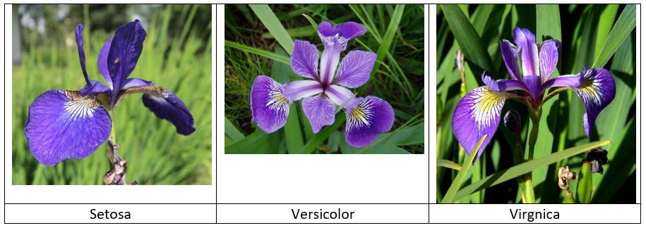
We will use the built in dataset.
data(iris); head(iris); summary(iris); str(iris)As we can see the species is already within the dataset, which defeats the purpose of clustering. However, we pretend that we want to define three different species automatically. We will use the pre-defined species and compare them to the ones suggested by the clustering algorithm.
Let’s visualise the cluster using the petal’s length and width.
ggplot(iris, aes(Petal.Length, Petal.Width, color = Species)) +   geom_point()+ theme(legend.position = c(.18,.73))
  unique(iris$Species)
The cluster on the left seems to be straight forward to identify. The top ones are slightly more difficult to distinguish.
We will focus only on the petal length and width, and ignore the sepal (green cover for petals) variables.
Use the kmeans function and form three clusters. Start
the algorithms-core 30 times, i.e. the initial centres of the clusters
are placed thirty times randomly. How well do they fit the given species
classification?
set.seed(7)
cm <- kmeans(iris[, 3:4], 3, nstart = 30)
cm
table(cm$cluster, iris$Species)
We see that the setosa cluster is perfectly matched. 96% of the versicolor species are identified and 92% of the virginica species.
Plot the new 3-means clusters.
cm$cluster <- as.factor(cm$cluster)
ggplot(iris, aes(Petal.Length, Petal.Width, color = cm$cluster)) + geom_point()+ theme(legend.position = "none")
Hierarchical Clustering
We will consider an agglomerative (bottom-up) approach.
Simple Call
Hierarchically cluster the iris petal data using complete linkage. First scale the data by mean and standard-deviation. Then determine all distances between all observations.
What distance measure was used by default?
# p_load(ggplot2, latex2exp) # for plots
# p_load(ggdendro, dendextend) # for dendograms
md = "complete"
hc = iris[, 3:4] %>% scale %>% dist %>%
  hclust(method = md)
hc
Determine the top three clusters and compare them to the actual species.
I = cutree (hc , 3)
table(I, iris$Species)
We see that the setosa and virginica species were modelled perfectly.
However, only 50% of the versicolor irises were identified correctly.
The problem is that we used the complete linkage, which was
inappropriate in this case.
Visualise the modelled clusters.
X = iris[, 3:4];
qplot(X[,1],X[,2],geom = "point",
        color=as.factor(I))+
    xlab(TeX("x_1"))+ylab(TeX("x_2"))+
    theme(legend.position = "none")
Dendogram
Let’s just use only a small sample (30 observations) to gain more insights about dendograms and their linkages. We begin by defining a function that prepares ourdendogram for plotting.
ppdend <- function(D, method="average", nb_clusters=3){
  return(D %>% scale %>% dist %>%
    hclust(method = method) %>% as.dendrogram %>%
    set("branches_k_color", k=nb_clusters) %>% set("branches_lwd", .6) %>%
    set("labels_colors") %>% set("labels_cex", c(.6,.6)) %>%
    set("leaves_pch", 19) %>% set("leaves_col", c("blue", "purple")))
}

set.seed(1); I = sample(1:150, 30);
X = iris[I, 3:4];

par(mfrow =c(2,3))
plot( ppdend(X,"single"),main="single")
plot( ppdend(X,"complete"),main="complete")
plot( ppdend(X,"average"),main="average")
plot( ppdend(X,"centroid"),main="centroid")
plot( ppdend(X,"ward.D"),main="ward.D")
plot( ppdend(X,"ward.D2"),main="ward.D2")
Let us have a look at a few more dendogram visualisations.
dend <- ppdend(X)
plot( dend ) # as before simple plot
ggplot(as.ggdend(dend)) # as ggplot
ggplot(as.ggdend(dend), labels = FALSE) +
  scale_y_reverse(expand = c(0.2, 0)) +
  coord_polar(theta="x") # as ploar coordinate plot
Resources
- Another Data Analytics tutorial “Data Analytics Tutorial for Beginners - From Beginner to Pro in 10 Mins! - DataFlair” (2019)
- Brauer (2020) is a very short introduction to R
- Field (2021) is a great book to discover statistics using R
- Shah (2020) is a hands-on introduction to data science (Chapter 9 explains the logistic regression)
- Trevor Stephens - Titanic an excellent tutorial, which provided several inspirations for this one.
- Kaggle Jeremy and logistic regression is another logistic regression tutorial.
- Titanic R library is yet another example using the Titanic data set.
- Titanic using Python is another brief tutorial.
Acknowledgment
This tutorial was created using RStudio, R, rmarkdown, and many other
tools and libraries. The packages learnr and
gradethis were particularly useful. I’m very grateful to Prof. Andy
Field for sharing his disovr package,
which allowed me to improve the style of this tutorial and get more
familiar with learnr. Allison Horst wrote a very
instructive blog “Teach
R with learnr: a powerful tool for remote teaching”, which
encouraged me to continue with learnr. By the way, I find
her statistic
illustrations amazing.
References